
1. Description
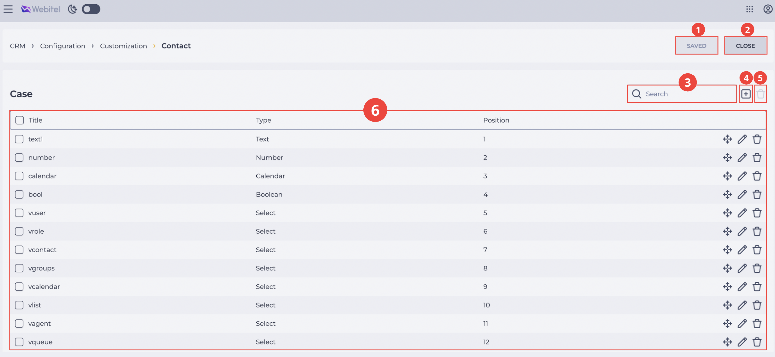
Used for creating and managing custom fields in the Contact card. Here you can add new fields, set their type, and define the display position in the Details tab of the Contact card (Fig. 1).
It consists of the following elements:
-
"Save" button (Fig. 1.(1));
-
"Close" button (Fig. 1.(2));
-
Search panel (Fig. 1.(3));
-
Add a new field tool (Fig. 1.(4));
-
Tool for deleting the selected field (Fig. 1.(5));
-
Record registry (Fig. 1.(6)).
1.1. "Save" button
All changes must be confirmed by clicking the "Save" button (Fig. 1.(1)). Without clicking this button, the changes will not be saved.
1.2. "Close" button
The "Close" button (Fig. 1.(2)) ends work with the section.
1.3. Search panel
The search field allows you to quickly find the required custom field by its name (Fig. 1.(3)).
1.4. Add a new field tool
To create a new field, click the icon 
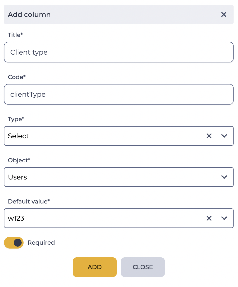
A modal window Add column (Fig. 2) will open. It contains the following elements:
-
Title field;
-
Code field;
-
Type field;
-
Object field;
-
Required switch;
-
Default value field.
-
The Add button creates a new field and adds it to the configuration.
-
The Close button closes the window without saving changes.
1.4.1. Title field
Required field, the name of the field.
1.4.2. Code field
Required field. A unique identifier that may include only Latin letters (A–Z, a–z) and digits (0–9) and must start with a letter.
1.4.3. Type field
Required field. A parameter that defines the data format to be stored in the corresponding field on the Details page. Available options:
-
Text — a field for text values;
-
Number — a field for numeric values;
-
Select — a list allowing the user to choose only one value;
-
Multiselect — a list allowing multiple values;
-
Calendar — a field for selecting a date;
-
Boolean — a switch that allows you to set two states: enabled


1.4.4. Object field
Selection of another lookup whose values will be used when filling this field.
Displayed only if the Type parameter is set to Select or Multiselect.
1.4.5. Required switch
The switch is displayed after selecting the field type (except for the Boolean type).
Enabling the switch
1.4.6. Default value field
Displayed after enabling the Required switch.
The field is mandatory to fill in.
The default value type corresponds to the selected custom field Type (text, number, select, multiselect, calendar).
The application of the default value depends on the state of the Details tab of the Contact card:
-
For existing contacts whose Details tab has not been filled in yet, the default value is not added.
-
For existing contacts whose Details tab has already been filled in, the default value is automatically applied to empty required fields.
-
For new contacts, the default value is not automatically applied, while the contact is saved.
1.5. Removal tool
Used for deleting fields with confirmation via a modal window. It is activated after selecting the checkbox next to the column.
When you hover over the delete button

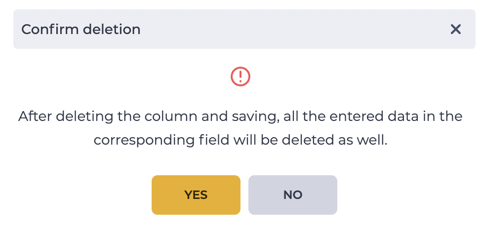
Clicking "Yes" deletes the field and all its records in the Details tab. Clicking "No" closes the modal window, and the field is not deleted.
1.6. Record registry
The table (Fig. 1.(6)) displays a list of all configured fields with the following parameters:
-
Title;
-
Type;
-
Position;
-
Move tool;
-
Edit tool;
-
Delete tool.
1.6.1. Title
The field name that will be displayed in the Details tab.
1.6.2. Type
The choice of the data format that will be entered into the field (Text, Number, Select, Multiselect, Calendar, Boolean).
1.6.3. Position
Defines the order of field display in the Details tab. The smaller the value, the higher the field is displayed.
1.6.4. Move tool
The icon 
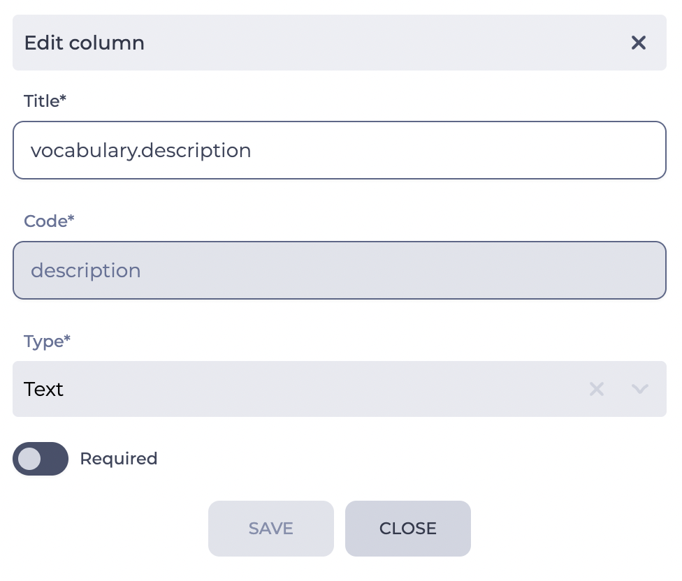
1.6.5. Edit tool
The icon 
1.6.6. Removal tool
The icon