
1. Description
Allows you to create a dropdown list populated with data from a selected system object.
This component is present in flow types like:
-
Forms.
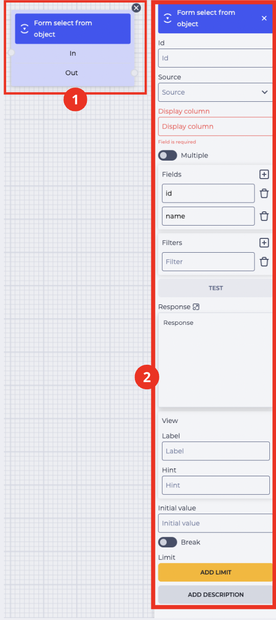
The block (Fig. 1.(1)) is placed in the field for building the scheme. Clicking the block opens the component settings panel (Fig. 1.(2)).
2. Form Select from object block
The "Form Select from object" block (Fig. 1.(1)) consists of the following elements:
-
Component name;
-
"In" branch — incoming (connects with the previous block);
-
"Out" branch — outgoing (connects with the next block).
When hovering over the "Out" field, a switch appears allowing the component to be connected to another block that already has a connection.
If the icon 
Toggling the switch 
The button 
3. Form Select from object settings panel
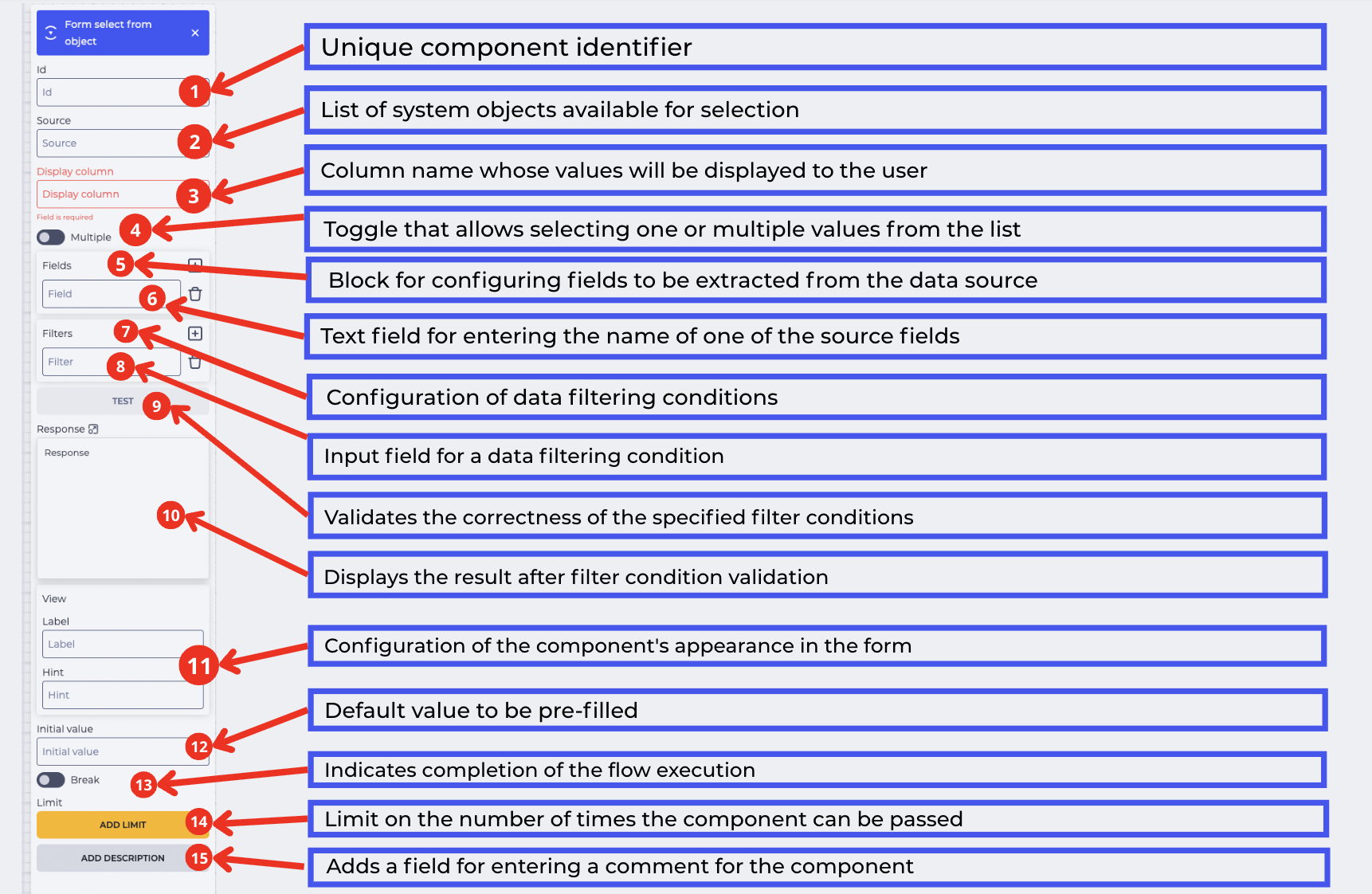
The component's settings panel (Fig. 2) consists of the following elements:
3.1. ID
The unique identifier of the component in the scheme (Fig. 2.(1)). The value selected by the operator in the dropdown will be saved to the variable with this ID. This variable can be used in further steps of the scheme.
3.2. Source
Selection of the system object (Fig. 2.(2)) from which data will be retrieved to populate the dropdown list. You can choose:
-
"Users"
-
"Roles"
-
"Contacts"
-
"Calendars"
-
"Lists"
-
"Queues"
-
"Communication Types"
-
"Cases"
-
"Contact Groups"
-
"Case Sources"
-
"Agents"
-
"Priorities"
3.3. Display column
Name of the column whose value will be shown to the user (Fig. 2.(3)). For example, this could be a contact name or other field. For directories, specify the internal field name to be displayed — e.g., "Name".
3.4. Multiple
Toggle (Fig. 2.(4)) allowing the selection of multiple values in the list.
-
If disabled

-
If enabled
3.5. Fields
The block (Fig. 2.(5)) is used to store additional fields from the selected system object. The data specified in this block is not necessarily displayed in the list for the user but remains available for use in the subsequent steps of the flow.
3.6. Поле “Field”
The field (Fig. 2.(6)) is intended for entering the name of an attribute from the data source that needs to be stored.
The attribute name must exactly match the data structure.
In the list, the user will only see the value specified in the Display column. However, in Fields it is possible to store any other data. This allows working with such values in the next components of the flow, even if they are hidden in the form itself.
You can add new fields — 

3.7. Filters
The Filters block (Fig. 2.(7)) allows specifying additional conditions to limit the list of data from the Source field.
By default, one "Filter" field is shown. It is optional and can be left empty.
3.8. Filter
The field (Fig. 2.(8)) lets you manually specify the condition to filter data from the selected source.
To fill this field correctly:
-
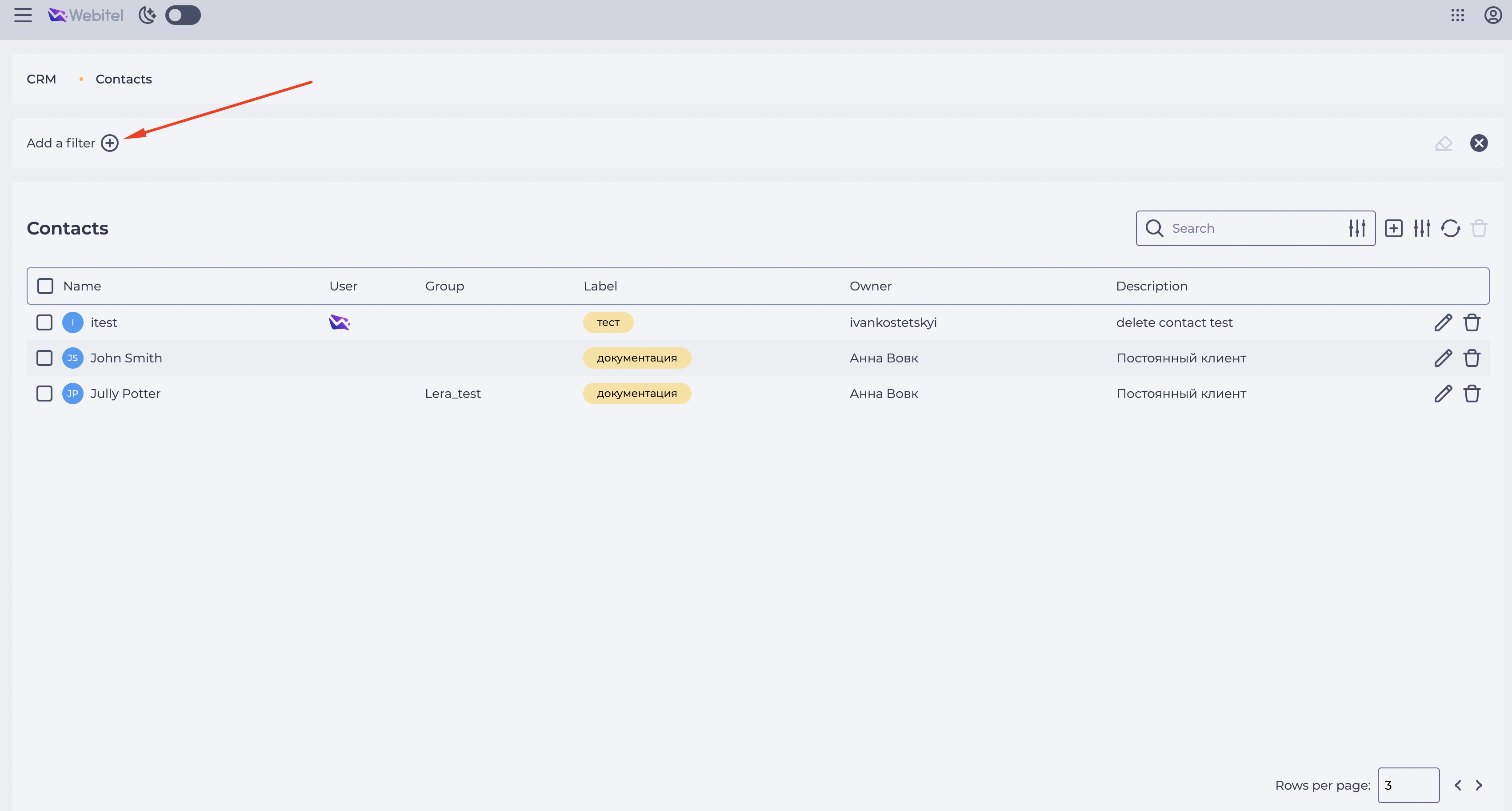
Go to the section where the entity is located (e.g., CRM → Contacts).
-
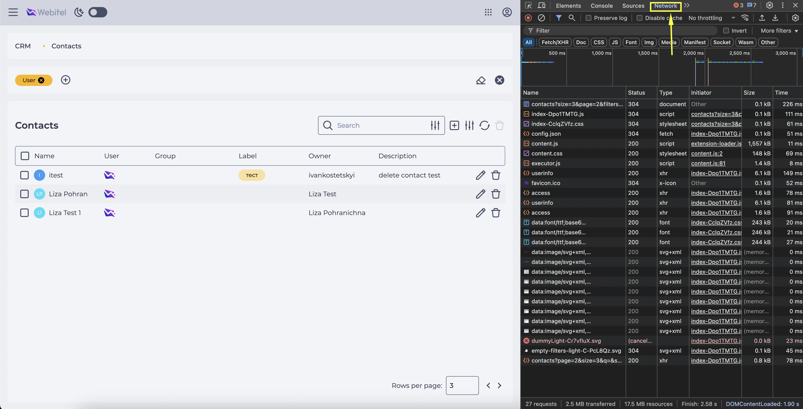
Apply the necessary filter in the regular interface (Fig. 3).
-
Open Developer Tools ("DevTools") and go to the "Network" tab (Fig. 4).
-
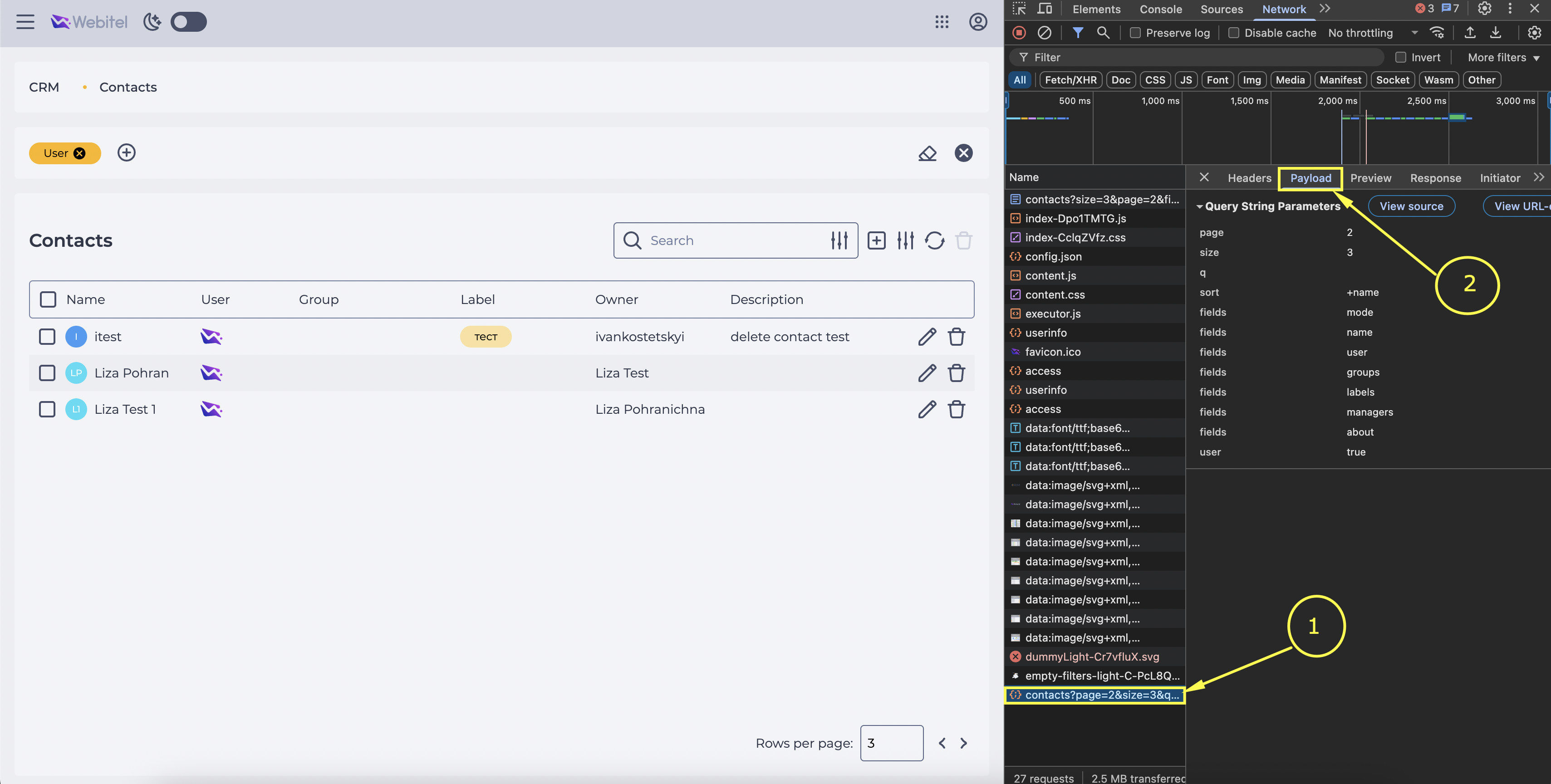
Find the request that adds the filters (Fig. 5.(1)) and go to the "Payload" tab (Fig. 5.(2)).
-
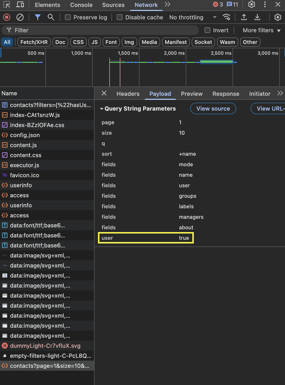
Copy the parameter name and value (e.g., user true) (Fig. 6).
-
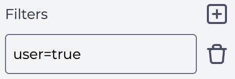
Return to the component in the scheme and enter the value in the "Filter" field in the following format:
user=true
Be sure to remove spaces and use the "=" symbol between field and value (Fig. 7).
The icon
Important! If multiple conditions are set, they all must be met simultaneously — the system will only search for records matching all the specified criteria.
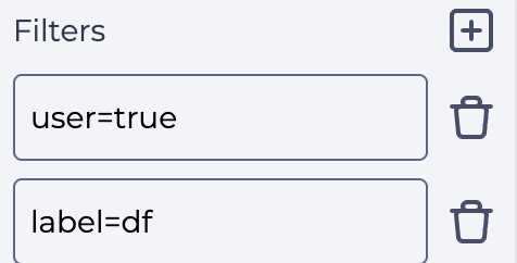
To remove a condition, click the icon 
Alternative method: instead of manually adding fields, write all conditions in one field using "&".
For example:
user=true&label=df
This format also means all conditions must be fulfilled simultaneously.
3.9. Test
The button (Fig. 2.(9)) checks whether the query returns results that will appear in the post-processing form.
-
After clicking "Test", the system sends a query considering all entered conditions.
-
If the conditions are valid, results will appear in the "Response" field (see 3.9).
-
If there is an error, no result may appear.
3.10. Response
The field (Fig. 2.(10)) displays JSON data returned after clicking "Test". To view the entire content, click the expand 

The field is view-only and not editable.
Each new click on "Test" updates the field content.
If the query was valid, the objects with values are displayed (Fig. 9).
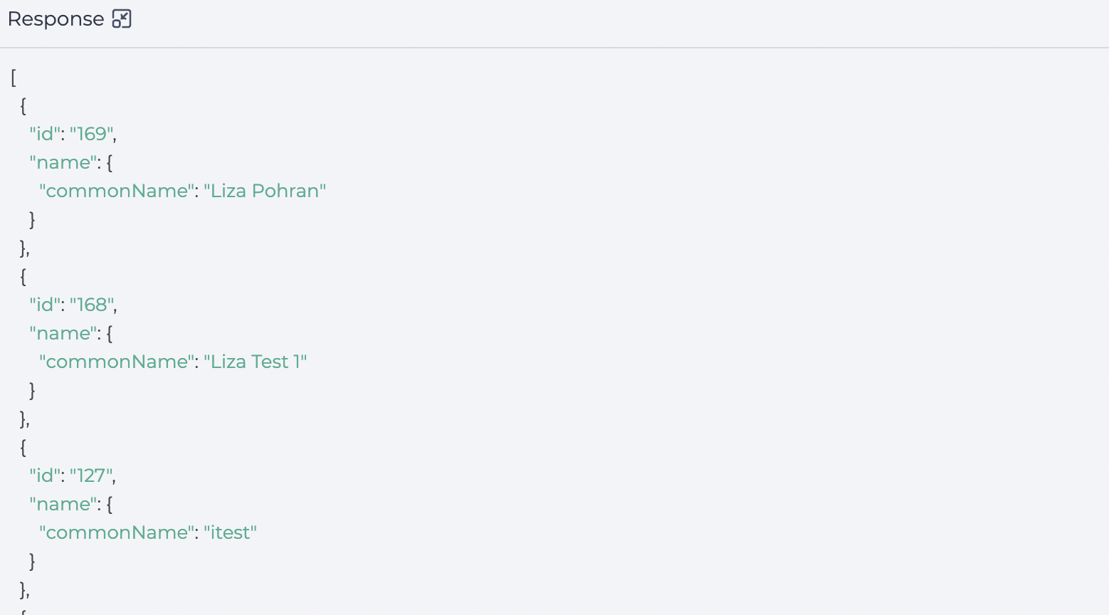
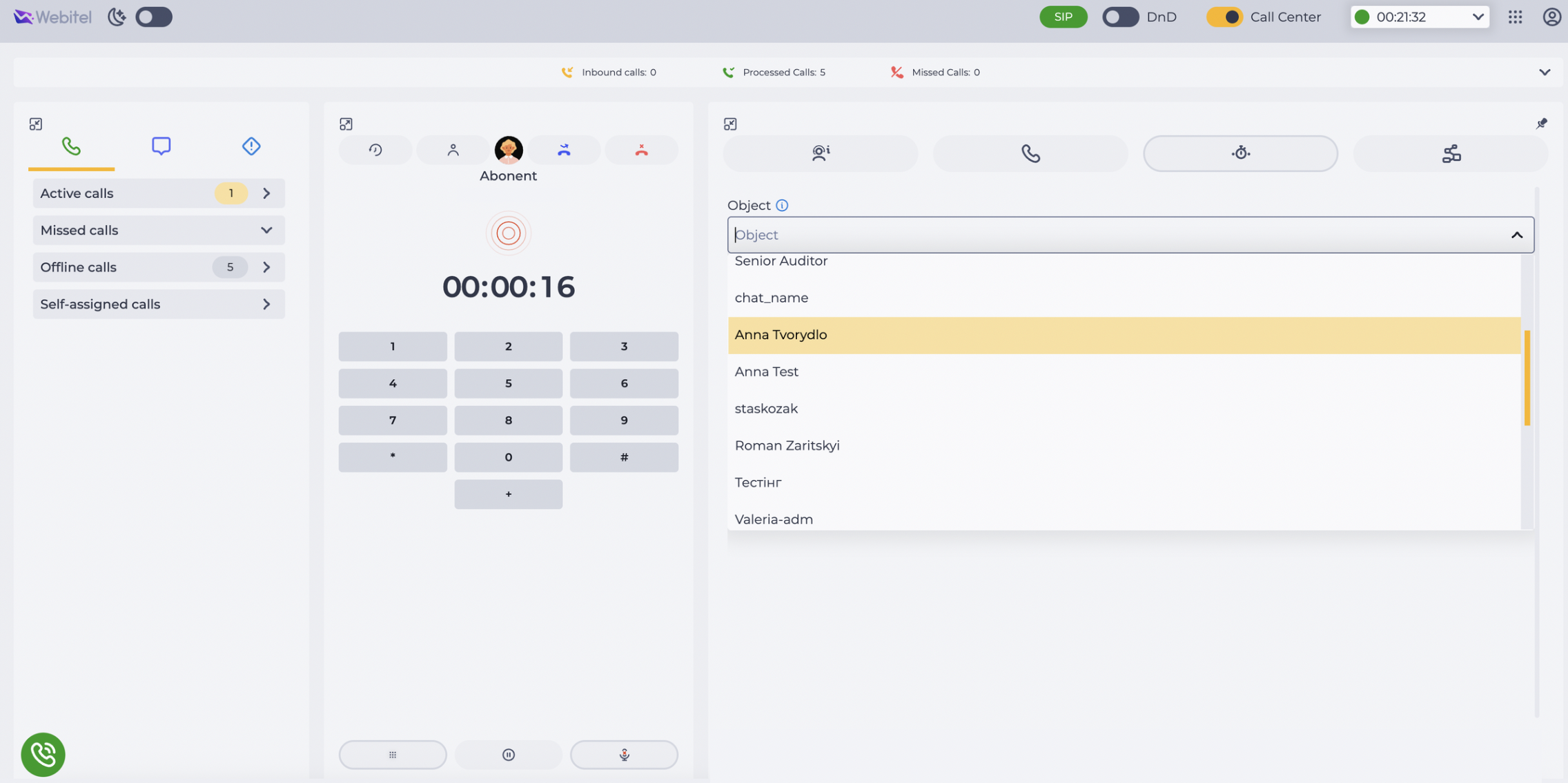
These values are then substituted into the dropdown in the post-processing form in Workspace (Fig. 10).
3.11. View
The block contains fields for configuring the component's appearance in the form (Fig. 2.(11)):
-
Label — the text shown above the selection field as its title.
-
Hint — a tooltip shown below the field explaining what to select.
3.12. Initial value
The logic of the field (Fig. 2.(12)) in Form Select from object is similar to a regular Form Select: it is the value automatically selected when the form opens.
If this value is not among the available options, the field is cleared.
Difference: in this component, the value is passed as a JSON object, e.g., {"ID":2,"name":"Liverpool"}.
3.13. Break
The toggle (Fig. 2.(13)) defines whether the scheme execution ends after this step.
-
-
3.14. Add limit
Used to define the maximum number of passes through this component.
Clicking "Add limit" (Fig. 2.(14)) adds the "Max" field and the "Delete limit" button (Fig. 11). The "Max" field defines the allowed number of passes.
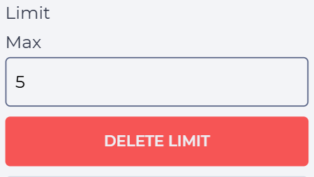
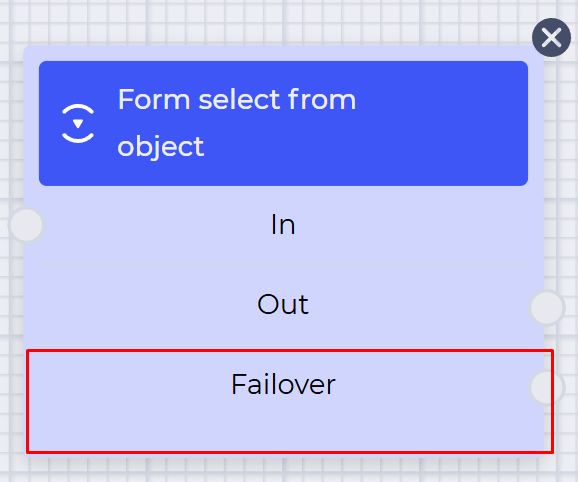
If the number of passes exceeds the value in "Max", the "Failover" branch will be used (Fig. 12), which appears in the component block after setting the limit.
Clicking "Delete limit" removes the limit and returns the "Add limit" button.
3.15. Add description
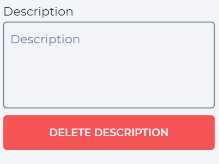
Clicking "Add description" (Fig. 2.(15)) adds the "Description" field and "Delete description" button (Fig. 13).
In the "Description" field, enter a comment about the component.
Clicking "Delete description" removes the description and restores the "Add description" button.
4. Display of the Component in the Post-Processing Form (Workspace)
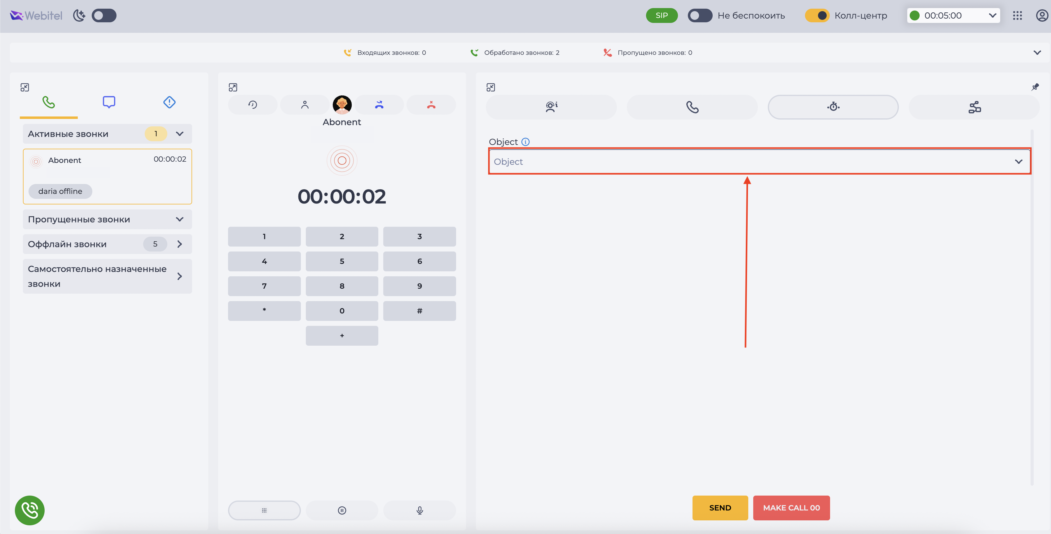
In the post-processing form, the Form Select from object component appears as a dropdown list labeled as specified in the "Label" field (Fig. 14).
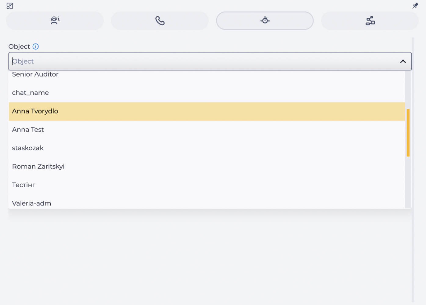
When the field is clicked, the list expands and shows all values fetched from the selected source and applied filters (Fig. 15).
The user can:
-
select one or multiple values (depending on the "Multiple" setting);
-
view only filtered data if conditions were set via the "Filters" block.