1. Description
Allows you to add a service selection from the “Service Catalogs” reference structure to the form. In the form, it is displayed as a dropdown list from which the operator can select a service for the Case.
This component is present in flow types like:
-
Forms.
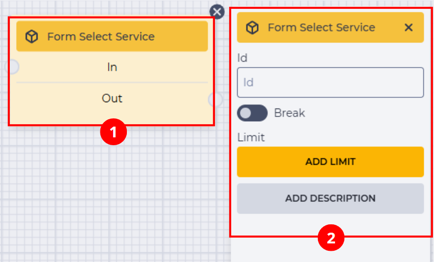
The block (Fig. 1.(1)) is placed in the scheme-building field. When you click the block, the component settings panel opens (Fig. 1.(2)).
Important!
In the form, the operator only sees the services that are available to them according to the settings in the “Service Catalogs” reference.
-
If Groups are linked to the catalog, the services will be available only to operators from those teams.
-
If Skills are linked — only to operators with the corresponding skills.
-
If both Groups and Skills are specified — access is granted to everyone who either belongs to the respective teams or possesses the required skill.
2. Form Select Service block
The "Form Select Service" block (Fig. 1.(1)) consists of the following elements:
-
Component name;
-
"In" branch — incoming (connects with the previous block);
-
"Out" branch — outgoing (connects with the next block).
When hovering over the "Out" field, a switch appears that allows this component to be connected to a block that already has a connection.
The presence of the icon 
Toggling the switch 
The 
3. Form Select Service settings panel
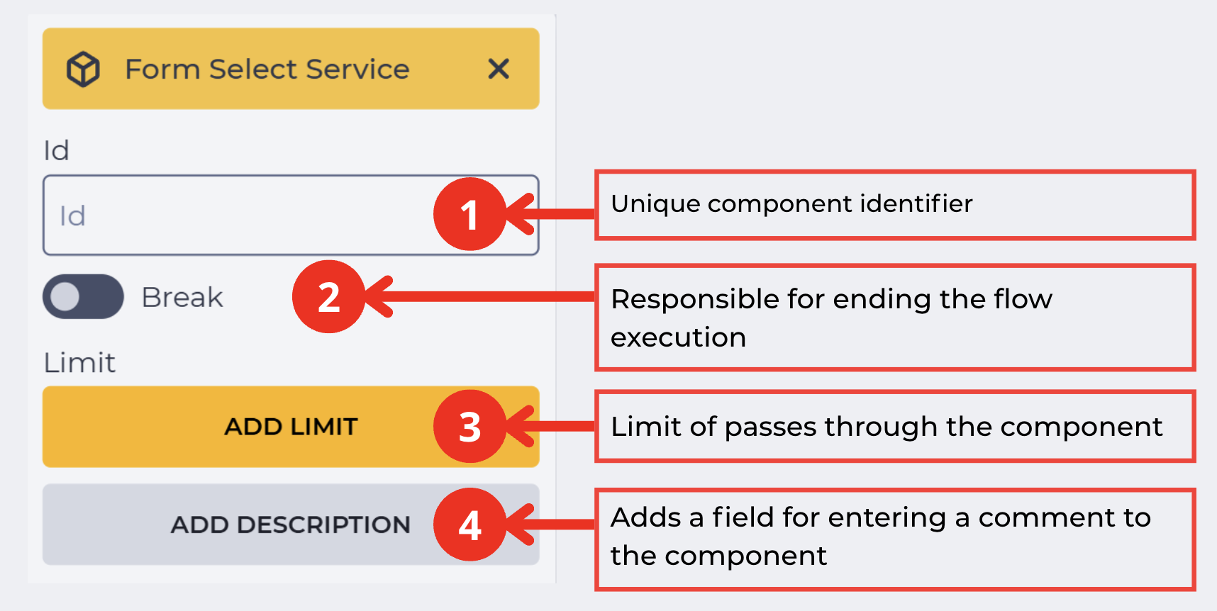
The settings panel (Fig. 2) contains standard fields:
3.1. Id
The unique identifier of the component in the scheme (Fig. 2.(1)).
The value selected by the operator in the service selection field will be saved in a variable with this identifier. It can be used in subsequent stages of the scheme.
3.2. Break
The switch (Fig. 2.(2)) determines whether the scheme execution will end after this step.
-

-

3.3. Add limit
Designed to set the maximum number of times this component can be passed.
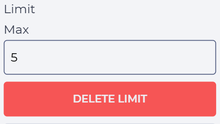
Clicking the "Add limit" button (Fig. 2.(3)) adds the "Max" field and the "Delete limit" button (Fig. 3). The "Max" field specifies the allowable number of passes.
If the number of passes exceeds the value specified in the "Max" field, the "Failover" branch will be used (Fig. 4), which appears in the component block after the limit is set.
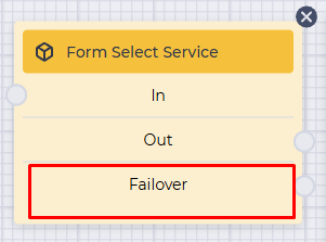
Clicking the "Delete limit" button removes the limit and returns the "Add limit" button.
3.4. Add description
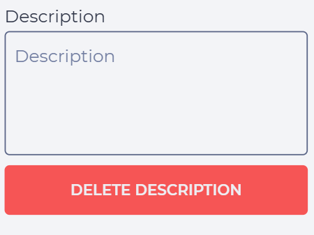
Clicking the "Add description" button (Fig. 2.(4)) adds the "Description" field and the "Delete description" button (Fig. 5).
The "Description" field specifies a comment for the component.
Clicking the "Delete description" button removes the description and restores the "Add description" button.
4. Component display in the post-processing form (Workspace)
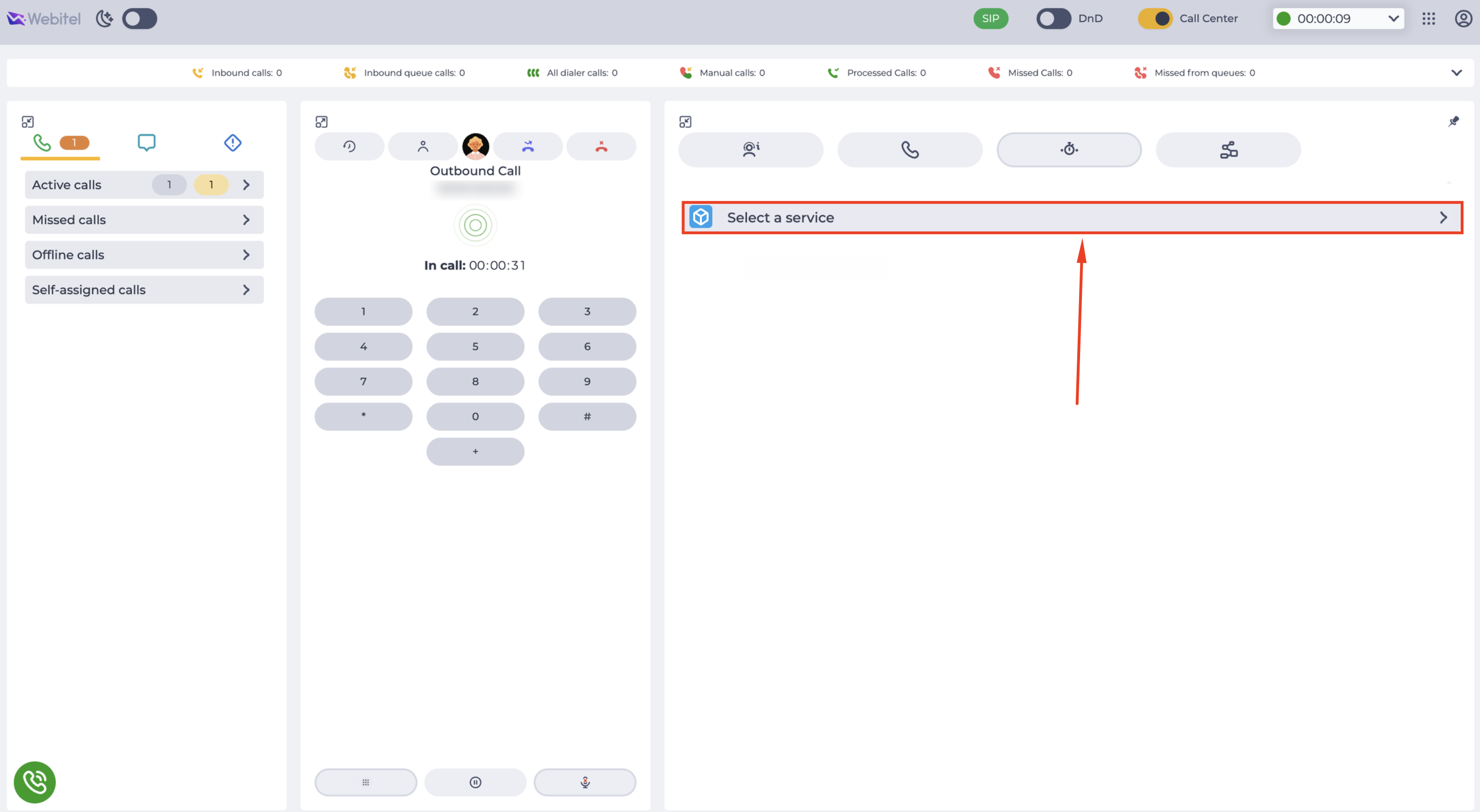
In the form, the Select Service element appears as a section that is initially collapsed (Fig. 6).
4.1. Service selection
When clicking the icon 
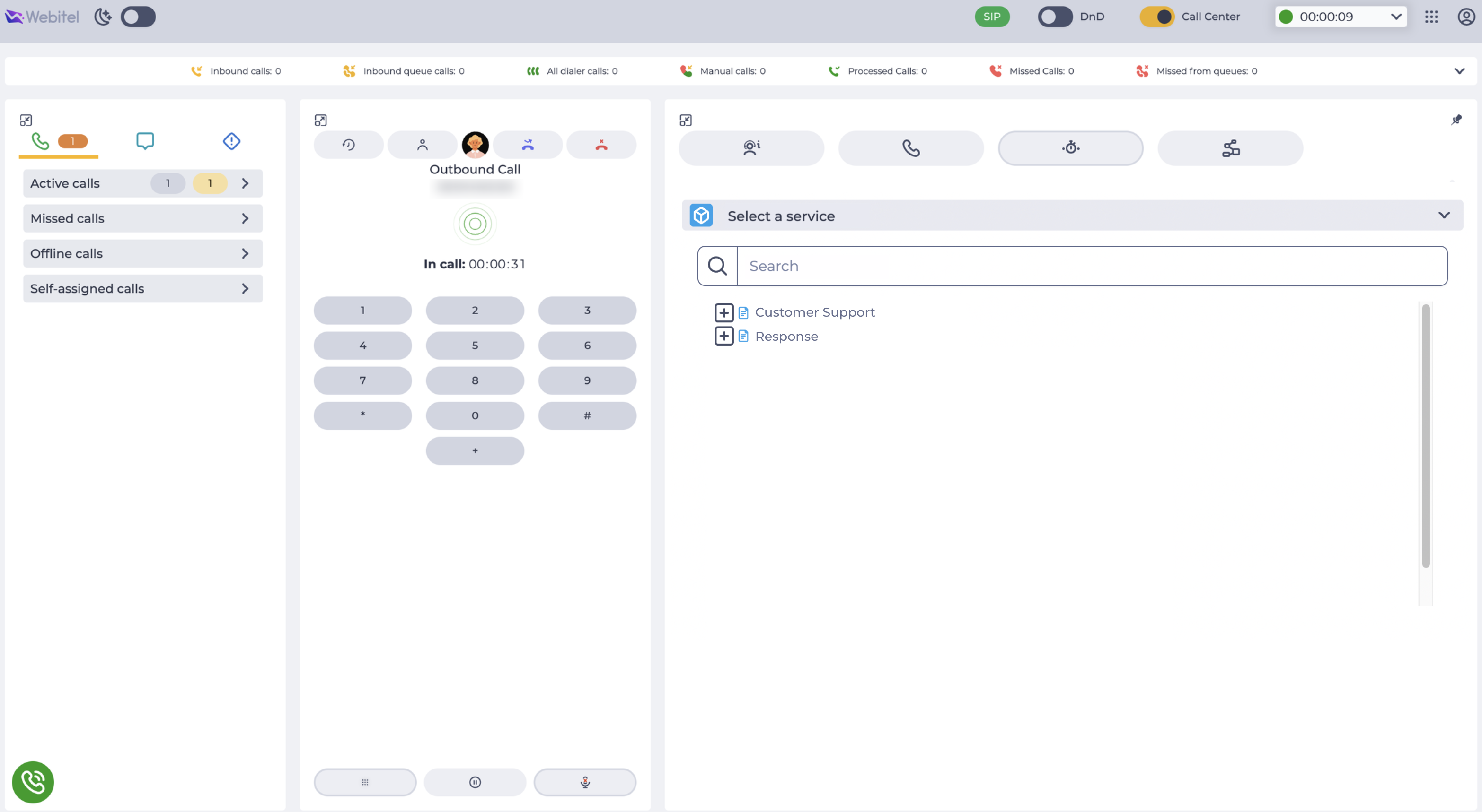
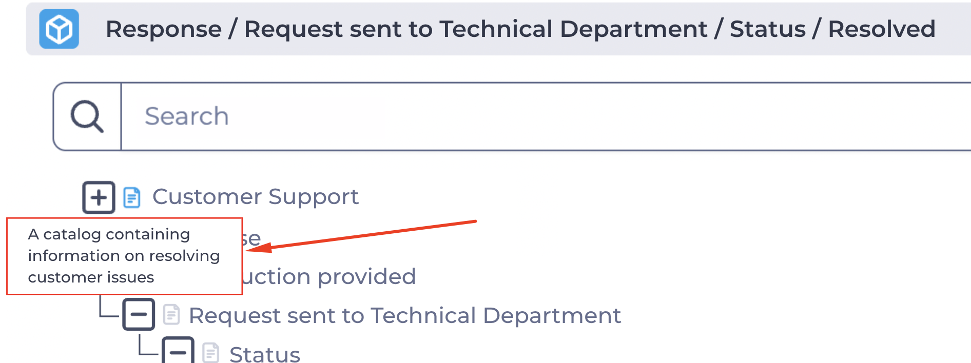
As the user types in the search field, the service tree updates in real time. All matches are highlighted in light blue (Fig. 8).
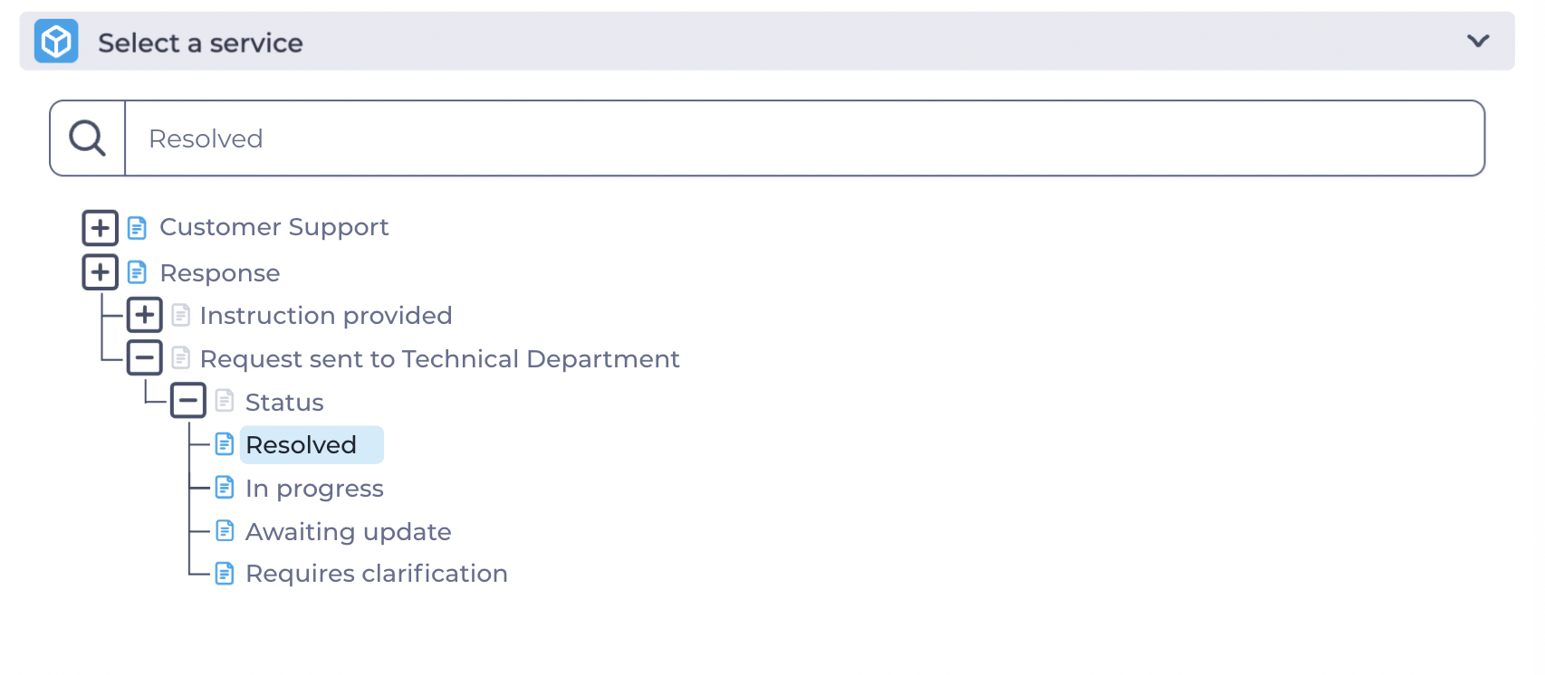
If the found item has child elements, the user can expand it to view the nested ones.
Only the lowest-level Service (leaf node) can be selected.
In this section, the user sees only those Services that are available to them according to the Catalog settings:
-
If Teams are linked to the Catalog, only operators from these teams can see the Services.
-
If Skills are linked, Services are available only to operators with the corresponding skills.
-
If both Groups and Skills are specified — access is granted to users who either belong to at least one of the teams or possess the required skill.
After selecting a Service, the value is highlighted in yellow, an icon 
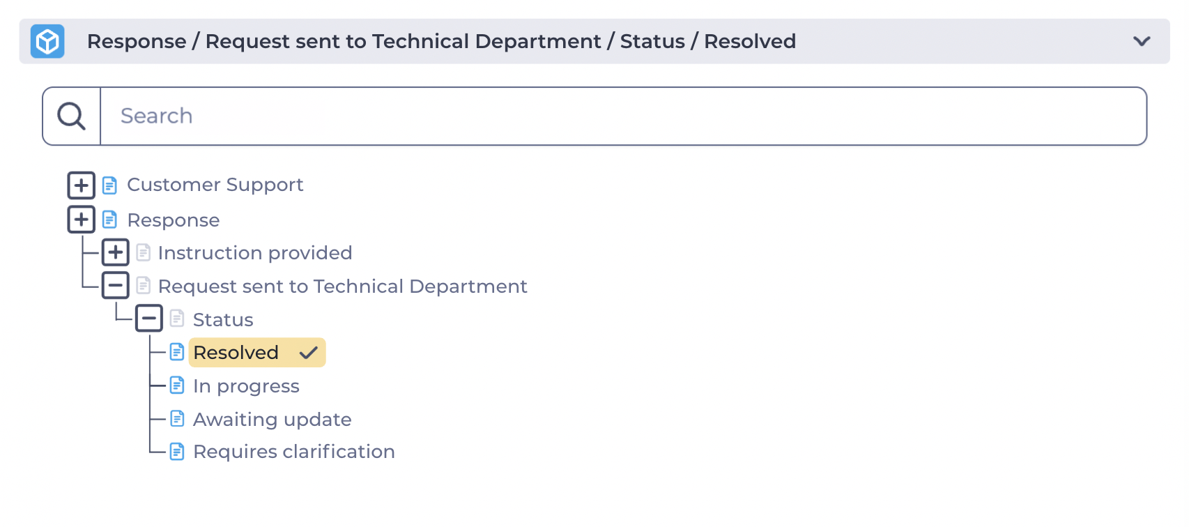
The header of the element displays the full path to the selected Service, allowing the user to see the context of the Service’s location within the catalog tree (Fig. 9).
4.2. Viewing the service description
An icon indicating the description status is displayed next to each service name in the tree.
-
If the Description field is filled in for a service in the Service catalogs directory, the description filled icon is displayed next to its name —

-
If the Description field is not filled in, the following icon is displayed —

When hovering over the description filled icon