
1. Description
It is designed to execute an HTTP REST request and process the result.
It integrates third-party systems (for example, Creatio, 1C).
It allows you to determine to whom to route the call and receive information about the subscriber from the CRS system.
This component is present in flow types like:
-
Voice;
-
Chat;
-
Forms;
-
Service.
The block (Fig.1(1)) is used in space to build the Flow. The settings panel for this component opens (Fig.1(2)) when you click on the block.
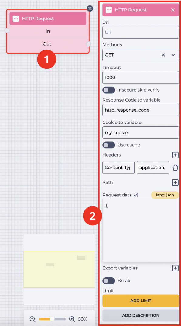
1.1. HTTP Request block
The block consists of the following elements:
-
The name of the component;
-
In branch — receiving (connecting with the previous block) branch;
-
Out branch — outgoing (connecting with the following block) branch. When hovering over the Out field, a switch appears. The switch allows this component to be connected to a component that already has a connection.
The presence of an 
Changing the switch position removes the outgoing branch of this component.
The 
1.2. HTTP Request settings panel
It consists of the following elements:
-
Url;
-
Methods;
-
Timeout;
-
Insecure skip verify;
-
Response Code to variable;
-
Cookie to variable;
-
Use cache;
-
Headers;
-
Path;
-
Request data;
-
Export variables;
-
Break;
-
Limit;
-
Add description.
1.2.1. Url
Here, you enter the URL address to which to make a request.
1.2.2. Methods
Here, you choose the method that will be used for the request.
The following options are available:
-
Post;
-
Put;
-
Get;
-
Delete;
-
Patch.
1.2.3. Timeout
Enter the maximum time to wait for a response in this field.
1.2.4. Insecure skip verify
Responsible for the use of self-signed certificates.


1.2.5. Response Code to variable
Enter the variable's name in which you want to write the server's response in this field.
1.2.6. Cookie to variable
Enter the variable's name in which you want to write the cookies transmitted in this field.
1.2.7. Use cache
Responsible for the ability to save cash.
1.2.8. Headers
It is designed to send HTTP headers.
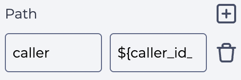
1.2.9. Path
It is designed to pass a variable to the URL address.
For example, it is used when it is necessary to pass caller_id_number to the link (Fig. 2).
1.2.10. Request data
This is where the request body is entered.
1.2.11. Export variables
It is intended to write the answer into variables and break it down into details for further analysis.
1.2.12. Break
Responsible for the completion of the flow execution.
-

-

1.2.13. Limit
It is intended to determine the maximum number of passes through this component.
The failover branch appears in the edited component when the limit is set 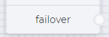
The failover branch will be used if more passes are passed through the component than entered in the Max field.
Clicking on the Add Limit button adds a Max field and a Delete limit button.
The number of possible passes is indicated in the Max field.
Clicking on the Delete limit button removes the limit and returns the Add limit button.
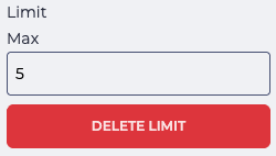
Fig. 3. Setting a limit
1.2.14. Add description
When you click the Add description button, a Description field and a Delete description button will be added.
The Description field is used to add comments to the component.
Clicking the Delete description button removes the description field and brings back the Add description button.
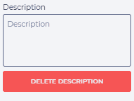
Fig. 4. Add description