
1. Description
The component for simultaneously sending a file (a link or a file from the Media Files section), text, and display customized buttons.
This component is present in flow types like:
-
Chat.
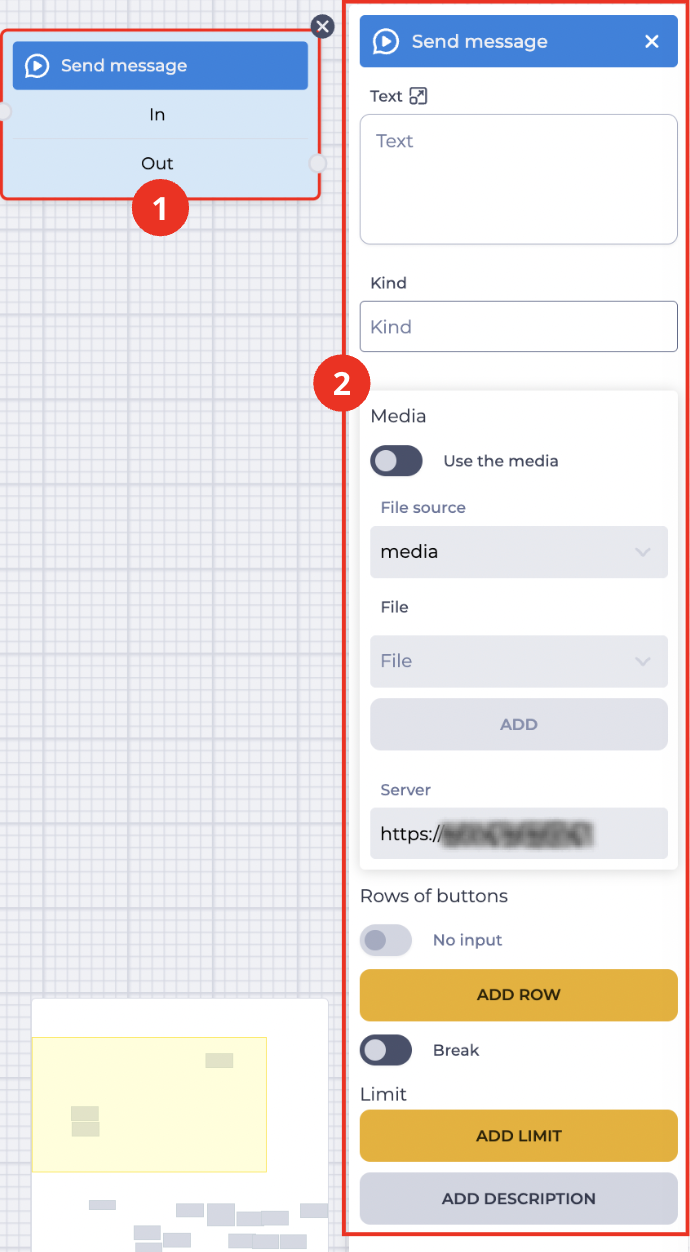
The block (Fig. 1.(1)) is used in space to build the Flow. The settings panel for this component opens (Fig. 1.(2)) when you click on the block.
1.1. Send message block
The block consists of the following elements:
-
The name of the component;
-
In branch — receiving (connecting with the previous block) branch;
-
Out branch — outgoing (connecting with the following block) branch. When hovering over the Out field, a switch appears. The switch allows this component to be connected to a component that already has a connection.
The presence of an
Changing the switch position removes the outgoing branch of this component.
The
1.2. Send message settings panel
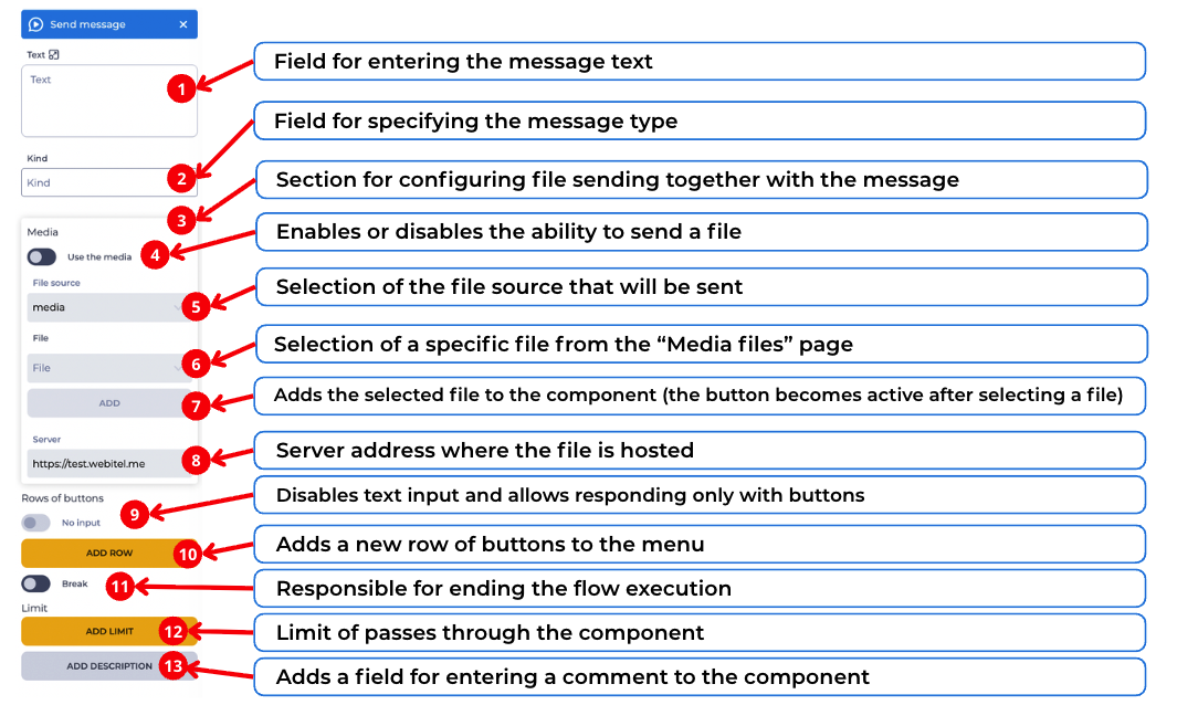
It consists of the following elements (Fig. 2):
1.2.1. Text
The body of the message enters here. It is possible to use variables in the text.
1.2.2. “Kind” field
An optional field. It is used to specify the type of message being sent so that the interface can display it differently.
Only the following characters are allowed in this field:
-
Latin letters;
-
digits;
-
the underscore character.
Format: /[a-zA-Z0-9_]/g.
The field may be used, for example, for service messages such as system.
1.2.3. Media
The Media consists of the following elements:
-
Use the media;
-
File source;
-
File;
-
Server.
1.2.4. Use the media
-

-

1.2.5. File source
This field selects the source of the file.
1.2.6. File
Select a file from the Media files section in the File field. After selecting the file, click the Add button to add it. You can delete the selected file by clicking the button.
1.2.7. “Add” button
A button used to add the file selected in the “File” field.
1.2.8. Server
Enter the server where the file is located in this field.
1.2.9. Rows of buttons
Designed to create a row of buttons in the navigation menu.
The No input switch becomes available when at least one row is present.

Only for portals!
1.2.10. Add row button
When you click the Add row button, a row is added, and the Button element (Fig. 3) for this row is displayed.
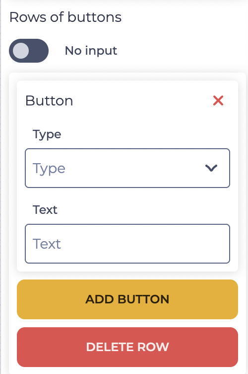
The Button element consists of these elements:
-

-
Type — button type;
-
Text — button text.
Add button — clicking this button adds a Button element to the row to which the Add button belongs.
Delete row button — clicking this button deletes the row and all buttons from this row.
1.2.11. Break
Responsible for the completion of the flow execution.
-

-

1.2.12. Limit
It is intended to determine the maximum number of passes through this component.
The failover branch appears in the edited component when the limit is set 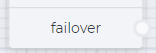
The failover branch will be used if more passes are passed through the component than entered in the Max field.
Clicking on the Add Limit button adds a Max field and a Delete limit button.
The number of possible passes is indicated in the Max field.
Clicking on the Delete limit button removes the limit and returns the Add limit button.
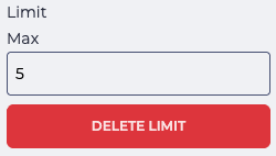
Fig. 4. Setting a limit
1.2.13. Add description
When you click the Add description button, a Description field and a Delete description button will be added.
The Description field is used to add comments to the component.
Clicking the Delete description button removes the description field and brings back the Add description button.
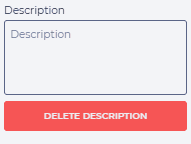
Fig. 5. Add description