
1. Description
The component is responsible for post-processing, leaving a corresponding message in the call history at a particular call status.
This component is present in flow types like:
-
Forms;
-
Service.
The block (Fig.1(1)) is used in space to build the Flow. The settings panel for this component opens (Fig.1(2)) when you click on the block.
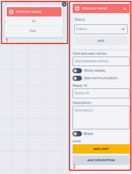
Fig.1. Attempt Result component
1.1. Attempt Result block
The block consists of the following elements:
-
The name of the component;
-
In branch — receiving (connecting with the previous block) branch;
-
Out branch — outgoing (connecting with the following block) branch. When hovering over the Out field, a switch appears. The switch allows this component to be connected to a component that already has a connection.
The presence of an 
Changing the switch position removes the outgoing branch of this component.
The 
1.2. Attempt Result settings panel
It consists of the following elements:
-
Status;
-
Wait between retries;
-
Sticky display;
-
Add communication;
-
Ready At;
-
Description
-
Break;
-
Limit;
-
Add description.
1.2.1. Status
It is designed to select the call status at which the text from the Description field will be written to the call history.
Click on the Status field to select a status, select the required one, and click the Add button.
You can select the status from the drop-down list or set your own by entering the text in the field.
The following options are available in the dropdown list:
-
Success;
-
Abandoned.
1.2.2. Wait between retries
Here, you enter how long to wait after an unsuccessful attempt to allocate the next attempt to the Agent. It is specified in seconds.
1.2.3. Sticky display
Responsible for linking the number that will be displayed to the subscriber. That is, which number will be displayed when calling again:


1.2.4. Add communication
Responsible for the ability to add a new number for a subsequent attempt.
When this option is enabled, the following fields appear:
-
Destination — contact information, for example, phone number;
-
Communication type — communication type for the number that is being added;
-
Priority — priority for the number being added relative to other contact information.
1.2.5. Ready At
This is the time in timestamp format (mostly will be passed from the Form Datetime Picker component) from the variable that will set the time of the next call.
1.2.6. Description
This field enters the message that will be recorded in the call history.
The message entered in the field will be displayed in the call history as an operator comment.
1.2.7. Break
Responsible for the completion of the flow execution.
-

-

1.2.8. Limit
It is intended to determine the maximum number of passes through this component.
The failover branch appears in the edited component when the limit is set 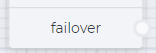
The failover branch will be used if more passes are passed through the component than entered in the Max field.
Clicking on the Add Limit button adds a Max field and a Delete limit button.
The number of possible passes is indicated in the Max field.
Clicking on the Delete limit button removes the limit and returns the Add limit button.
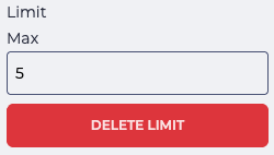
Fig. 2. Setting a limit
1.2.9. Add description
When you click the Add description button, a Description field and a Delete description button will be added.
The Description field is used to add comments to the component.
Clicking the Delete description button removes the description field and brings back the Add description button.
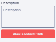
Fig. 3. Add description