1. Description
Designed to open a link passed as text, variable, or URL.
This component is available in the following types of schemes:
-
Voice
-
Text
-
Form
-
Service
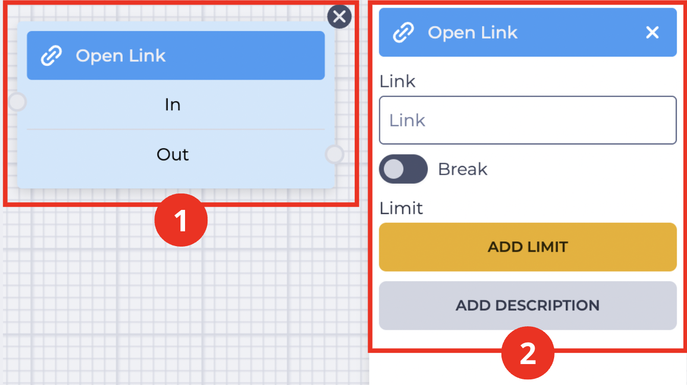
The block (Fig. 1.(1)) is used in the field for building a scheme. When you click the block, the settings panel of this component opens (Fig. 1.(2)).
2. Open Link block
The Open Link block (Fig. 1.(1)) consists of the following elements:
-
Component name
-
In branch — input (connects to the previous block)
-
Out branch — output (connects to the next block)
When hovering over the Out field, a toggle appears that allows you to connect this component to a block that already has a connection.
The presence of the icon 
Changing the toggle 
The button 
3. Open Link settings panel
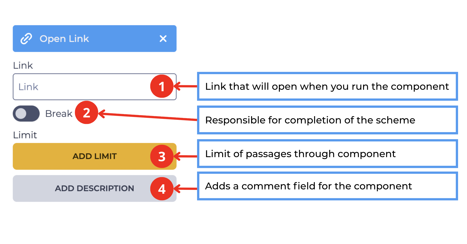
The settings panel of the Open Link component (Fig. 2) consists of the following elements:
3.1. Link field
The Link field (Fig. 2.(1)) defines the URL address that will be opened when the component is executed.
You can specify:
-
a static link (for example,
https://webitel.com) -
a variable (for example,
${customerLink}) -
a combination of a link and a variable (
https://webitel.com/${caseId})
3.2. Break toggle
The toggle (Fig. 2.(2)) defines whether the scheme execution will end after this step.
-

-

3.3. Add limit element
Used to define the maximum number of passes through this component.
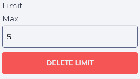
Clicking the Add limit button (Fig. 2.(3)) adds the Max field and the Delete limit button (Fig. 3).
In the Max field, specify the allowed number of passes.
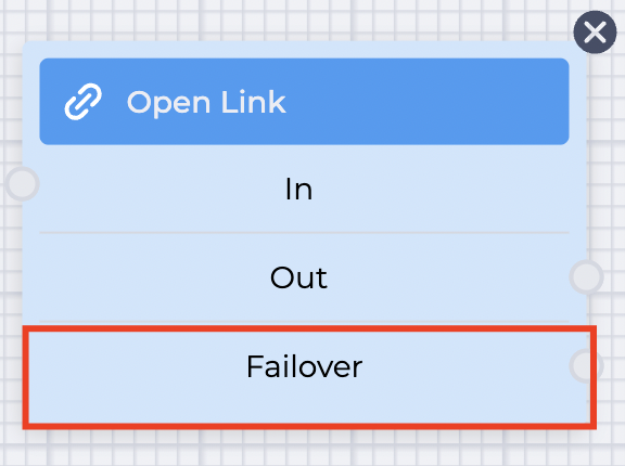
If the number of passes exceeds the value specified in the Max field, the failover branch (Fig. 4) is used.
This branch appears in the component block after the limit is set.
Clicking the Delete limit button removes the limit and restores the Add limit button.
3.4. Add description element
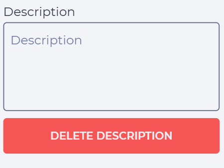
Clicking the Add description button (Fig. 2.(4)) adds the Description field and the Delete description button (Fig. 5).
In the Description field, enter a comment or note for the component.
Clicking the Delete description button removes the description and restores the Add description button.